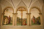
This is Perugino's piece, and here we see many standard Perugino staples. As with previous pieces, the setting in this is very serene, which again reflects Perugino's state of being at the time. One thing that we see him doing, as he does in many other pieces, is placing all the characters together in a flat, linear fashion in the foreground. While this doesn't make for the most dynamic format, it does also contribute to the serene nature of the painting. Everything is again very harmonious and united, and again the use of aerial perspective shines through. the soft background serves to de emphasize the drama, as does the static nature of the figures.
Now, for Raphael's rendition. A significantly more dynamic and richer piece than Perugino's, but it's easy to see where he drew his influence when we look at the previous version of the piece. There's stronger 1 point perspective, characters depicted in deeper, richer colors, stronger depictions of the building in the background, and more dynamic poses for the players involved in the marriage in the foreground. But every strong element in this piece is in fact derived from Perugino's version. Which is pretty neat. We see Raphael woring to push the drama, and the dynamic figures and the engaging dramatic aspect of the scene, which is only different in the previous version because the point of the thing was to remove the drama. Raphael paints a more dramatic picture because he wants to instill drama and movement and excitement. Perugino is serene because his whole shtick is removing that. We see it in the use of pastel colors to depict the scene, the gentle slope of the perspective tricks used to lead up to the building in the background, the harmony between the scenery and the characters in the foreground, their static nature. It's all about serenity and loss of drama.


